Ecosmic
Rebranding
THE CONTEXT
Ecosmic is a software startup operating in the aerospace sector, with a clear mission: making space operations more sustainable. As the brand evolved, it needed an identity that could move beyond the “cosmic” reference and reflect its true nature — software-driven, forward-looking, and precise.
BEFORE

AFTER

THE BRIEF
The previous logo leaned into the space theme with an illustrative style. While it worked in the early stages, Ecosmic was ready to reposition itself. The brand needed a visual language that would be more aligned with its product — collision avoidance software — and its purpose: simplifying complexity in an overwhelming industry.
THE SOLUTION
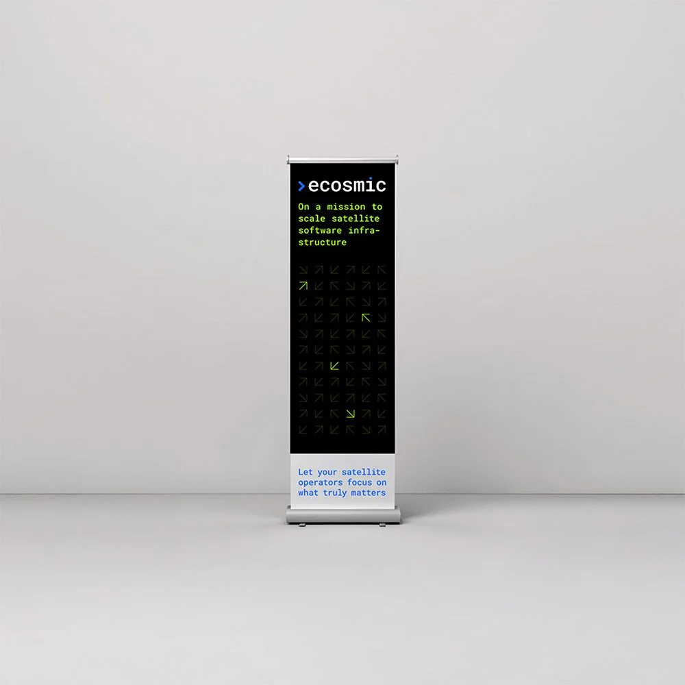
The new brand identity revolves around clarity and minimalism. The custom wordmark, in lowercase Roboto Mono, reinforces Ecosmic’s software core and emphasizes a human, approachable tone. The typographic system mirrors coding culture, while the iconography and color palette are designed for modularity, legibility, and cross-platform consistency. Every element — from pitch decks to t-shirts, from social media to trade show materials — follows precise guidelines that ensure coherence without rigidity.

THE RESULT
A contemporary identity system that highlights Ecosmic’s dual nature — tech-savvy and mission-driven — while standing out from the aesthetics of traditional aerospace players.